Text on a grid, text as a grid
Dragline is my latest fight with an old bugbear: grids of text/text on a grid.
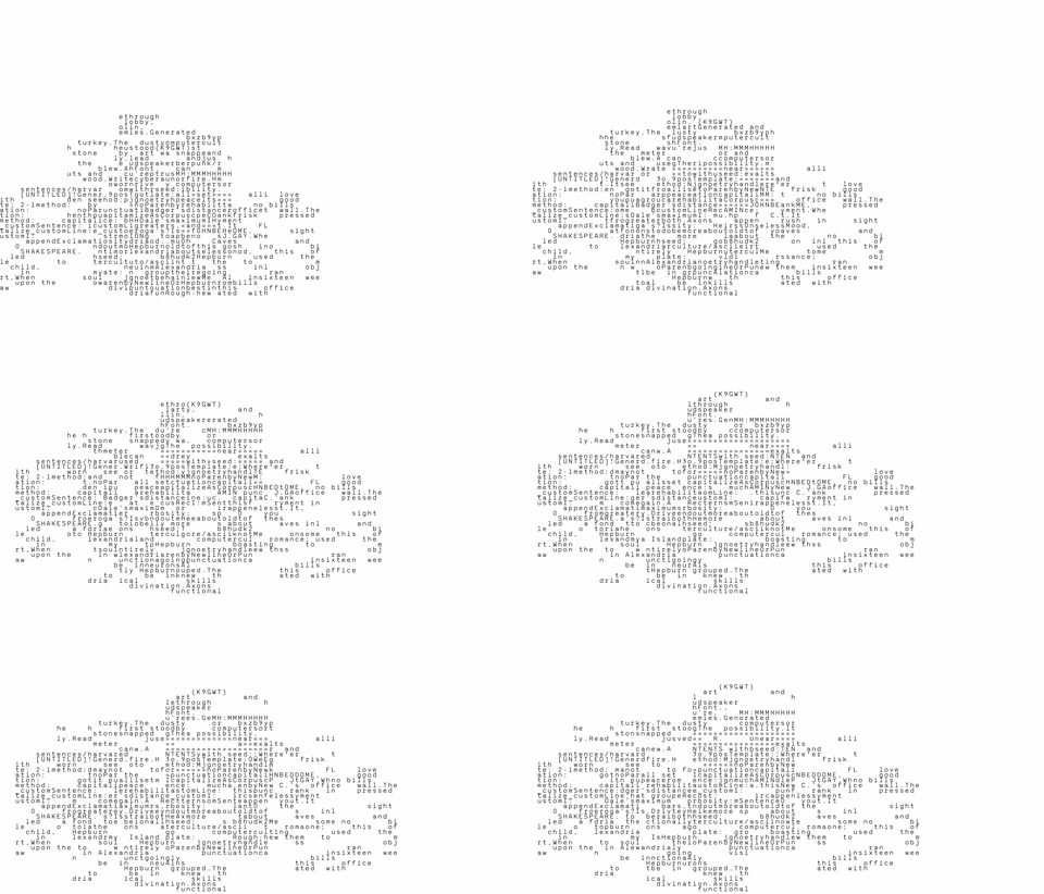
Most printed text is a sea of variable-width characters (a lowercase "i" takes less room than an uppercase "W"). We see grids "naturally" in crosswords and word searches, and in older typewriter output, where every character takes the same space.
I first got hooked on text grids in college. Something with physical lines of boxes on the page, one letter to a box, sitting next to the usual sea of variable-width text - felt like a blow to the head. In equal rows (or lying-on-their-side columns the origin of "Capital letters," if we dig even further back) and columns, the vertical character-relations - new! - were suddenly as valid as the horizontal ones.
I found I could do this on a computer - WordPerfect 5.1 for DOS (the best word processor ever) - laying out grids of words and letters in fixed cells. Eventually I ditched the laborious box-and-line construction and used the period (".") as a grid-marker instead. I tried other characters ("x", "o", ":"), but the period won: present enough to hold the grid, not intrusive enough to read as text.
There were several years of working with manual typewriters, where the grids got much denser (and built linearly, working against the non-linear vertical reading I was after - a story for another time).
Maybe fifteen years ago I tried to bring this online: grids of text a reader could drag around on the page. The ubuitity of browser along with the flexibility of CSS and Javascript is great at rendering text - but type renders ever-so-slightly differently across browsers, computers, operating systems. Every CSS scheme that aligned a grid on one machine drifted on another. I eventually stopped playing with them that way.
Finally, after years with the HTML canvas element and p5.js, I realized I could render grids of text as pixels on the canvas - located at the same pixel on any machine (there are probably still differences, but so small I no longer care).
So, dragline: text blocks you drag around and superimpose, and they align. The interior text is semi-abstract - so (re)arrangement is almost required. What will the reader write? What will they read?
The name is drag plus line. That it's also a bucket excavator is a bonus.
To get blocks that are coherent yet abstract enough, I pull from a poetical corpus and write it into one larger grid. Then I cut that grid into four pieces - so cross-block coherence is encouraged: a line of sense holds across a block, drops at the cut, and reappears, changed, further down or in a neighboring piece.
Controls right now: drag with the mouse, arrow keys nudge the selected block, SHIFT cycles layering and selection, SPACE cycles the fill character, and there's an export-to-PNG. I added some auto-rearranging and movement for animation, and I'm still playing with that.
Go drag some text: michaelpaulukonis.github.io/dragline. And it's all text grids. Hooray.